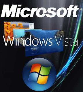
Visual Impact required a report to justify the Microsoft image I created. It was to be on display at the Birmingham NEC so it needed to be like a poster.
Software and Tools - The software I used to make this image was Photoshop Elements and I think this is a good choice of program to use because you can use many tools on it to manipulation photos and create graphics. Which is good because you can make unique and individual graphics for businesses etc. The fits the clients needs because Photoshop is a popular choice to work with graphics, Photoshop is also good and fits the requirements because it allows me choose different size canvas. When I set up my blank page I set the dimensions to look like a poster (900x1000 pixels). Photoshop also lets users use a number of tools and techniques to create an image to fit the specification, in this particular graphic I used the magic wand tool, background eraser, colour fill, crop, resize and layering techniques. Photoshop is good because I can resize images without them looking too pixelated.
Colour depth - The program also allows me to change colour depth, it's default colour depth is 72 which conveys good colours and quality, I could easily change the colour depth to a smaller amount, but I did not do this because it would allow less colours visible on the poster. High colour depth is an advantage to this production because it means the print outs will be good to meet the user and client needs and because it is a display, the colour depth needs to be high for nice print outs. Changing the resolution is also an option when using Photoshop.
Image resolution - Image resolution is measured in ppi (pixels per inch) and printer resolution is measured in dpi (dots per inch). Images with higher dpi values have more data and result in higher print quality. You can resize images, to create a larger print size, but the print quality can decrease due to the reduced print resolution (ppi). I am using a standard image resolution setting so I have considering the quality printer outs for the clients needs when printed out to be a poster.
File Format - It was originally saved as a Photoshop Elements image, then to upload on Blogger, I had to save the file as a Jpg or Gif because the Photoshop file was too large for blogger to be able to store it on the blog. Jpg and Gif are the best file formats because they don't allow too much quality to be lost on the graphic and they do a good job of making the size of the file smaller. This fits the client needs because the image can be saved to different formats without looking a lot different to the original, so the graphic can be sent to other computers without them having Photoshop Elements and the image can be opened onto different programs.
Thursday, 19 June 2008
Thursday, 12 June 2008
M3 file format, compression techniques, image resolution and colour depth
File Format, Compression Techniques, Image Resolution and Colour Depth (M3)
JPEG is a file format used to compress photographic images. JPEG typically achieves 10 to 1 compression with little perceivable loss in image quality.JPEG is the most common image format used by digital cameras and other photographic image capture devices, and is the most common format for storing and transmitting photographic images on the world wide web.
Zip files are single files sometimes called archives, that contain one or more compressed files. Zip files make it easier to keep related files together and make transporting, emailing, downloading and storing data. The Zip format is the most popular compression format used in the Windows environment, and WinZip is the most popular compression utility. To store files in a Zip file, or to access the files in a Zip file, you need a compression utility such as WinZip. WinZip makes it easy for Windows users to work with archives. WinZip features a standard Windows point-and-click drag-and-drop interface for viewing, running, extracting, adding, deleting, and testing files in Zip files. Occasional and first-time users can choose to use the intuitive WinZip Wizard.
Image resolution describes the detail an image holds. The higher the resolution, the higher the detail in the image. resolution quantifies how close lines can be to each other and still be visually resolved.
When you zoom in closely on an image, you begin to see the pixels and in some photo manipulation programs, you can colour in individual pixels to make the quality better. Making and image too big or too small can ruin the quality of an image so this is the problem with manipulation of images.
Colour depth is a term used to describe the number of bits used to represent the colour of a single pixel in a bitmapped image or video frame buffer. This concept is also known as bits per pixel (bpp), particularly when specified along with the number of bits used. Higher color depth gives a broader range of distinct colors.
Demonstration Of File Compressions
Here is a screenshot of how to save my image to web on Photoshop. The current image I am working on is the top image, and the bottom image is the compressed image. It has been changed to a gif file, and I have allowed four colours to be visible on the second image (black, yellow, green and white), the red is not visible. There is also a change in the file sizes, the top image is 284 KB and the bottom image is 3.84 KB so it has been compressed but lost a lot of quality.
M2 advanced techniques in Photoshop
Two advanced techniques in Photoshop (M2)
Adjusting The Colours In Photoshop
I got an image of the sky and wanted to change the way it looks because if it was used on a poster or some sort of advertisement, the colours do not attract attention. Here is the original image of the sky I am going to edit it using a number of techniques and tools in Photoshop.
The first tool I am going to use is colour variations. It allows you to change the colours on images by increasing the intensity, if i was to increase the intensity bar even more, the sky would be able to change to other colours such as greens, purples etc. I want to increase the blue to make it more vibrant, so it has been darkened on the midtones selection.
I used a brightness and contrast tool called levels. It allowed me to get rid of the faded out washed look, so the colour is more vivid and eye catching. Photoshop as a graph like tool where it shows it intensity of the colours, I have moved the arrows across the input level.
Here is the final image of the sky, the blue is more vibrant and the contrast between the white colours and the sky stands out more.
P4 create and review three original graphic images to meet a defined user need
EnCert (P4)
My job was to design a logo for an energy company called EnCert. They provide energy certificates to homeowners and required the logo to be used for their new website and on the letterheads. It needed to look professional and also associated with the company. The colours I have chosen are contrasting, so it is easy to see and it stands out. I have used a black background because it is simple and light luminous colours stand out on them, a simple image of a red flame, red, green and white font. The type of font I have chosen is easy to read and it is a professional font so you can tell the logo belongs to a formal organisation. The Encert name is in two colours – white and green, the white looks best on the flame, and the green stands out and also represents energy, it is also written in large writing because this is the most important thing in the logo is the name. The tagline is written in small and red slightly overlapping the name to create effect and it makes the logo look tidier, both fonts are the same so the writing doesn’t look messy. Overall, I think the logo meets the requirements because it has an essence of energy from the flame image and also an environmental aspect from the green font.
1. Set up a blank page in Photoshop and got images off Google
2. Set the background image to fit the page
3. Got the Microsoft title and put it into my logo, used the magic wand tool to get rid of the white background colour, resized the font, and filled each letter to a blue colour
4. Got my final image of the Windows Vista logo, used the magic wand tool to get rid of excess white background, then I positioned the logo in a suitable place
Burger Factory requires a graphics designer to create a logo suitable for car drivers to be seen on the road. I need it to stand out by using vibrant colours so passing drivers can see the logo. Burger Factory is a fast food service which cooks and sells organic food. The logo would be a road side sign. I have used Photoshop to create this logo and I got all my images off Google, I wanted to make the colour scheme vibrant to meet the requirements, but I also wanted to use pastel colours to convey the organic food they sell.
My job was to design a logo for an energy company called EnCert. They provide energy certificates to homeowners and required the logo to be used for their new website and on the letterheads. It needed to look professional and also associated with the company. The colours I have chosen are contrasting, so it is easy to see and it stands out. I have used a black background because it is simple and light luminous colours stand out on them, a simple image of a red flame, red, green and white font. The type of font I have chosen is easy to read and it is a professional font so you can tell the logo belongs to a formal organisation. The Encert name is in two colours – white and green, the white looks best on the flame, and the green stands out and also represents energy, it is also written in large writing because this is the most important thing in the logo is the name. The tagline is written in small and red slightly overlapping the name to create effect and it makes the logo look tidier, both fonts are the same so the writing doesn’t look messy. Overall, I think the logo meets the requirements because it has an essence of energy from the flame image and also an environmental aspect from the green font.
How I created my logo:
1. Set up a blank sheet on Photoshop, set the background colour to black
2. Got an image off Google, which was the picture of the flame
3. The flame image had a white background so I used the magic wand tool to delete unwanted background
4. I inserted my text for the company name, selected font, colours and size and positioned it where I wanted it.
Microsoft (P4)
Microsoft wanted a graphics designer to create a logo which will be on display at Birmingham NEC to advertise it's new operating system. The logo will need to be printed onto a large piece of card that stands up. The logo I was to design needed to be linked with previous Microsoft logos and colours so it will not be a completely different design to what Microsoft will expect. I wanted the logo to stand out, but I also wanted to keep images and colours to a limit so it looks professional and part of a world wide business which it is. The background I have used on my logo, is actually a desktop wallpaper of the new operating system Windows Vista, so this is connected and an actual design. I have used the original Microsoft font for the title, it is large and positionted at the top of the logo, and I have changed it's colour from white to a vibrant blue. The tagline of Microsoft, I have used a different white font which looks professional, and this is in the centre of my logo. Then the Windows Vista logo in a bubble is at the bottom and I have enlarged it. Note the size of the image and the dimensions are because it will be printed on card in a stand. Overall, I think it would fit the requirements, but if it was advertise the operating system, more details would need to be on it.
How I created my logo:
1. Set up a blank page in Photoshop and got images off Google
2. Set the background image to fit the page
3. Got the Microsoft title and put it into my logo, used the magic wand tool to get rid of the white background colour, resized the font, and filled each letter to a blue colour
4. Got my final image of the Windows Vista logo, used the magic wand tool to get rid of excess white background, then I positioned the logo in a suitable place
Burger Factory (P4)
Burger Factory requires a graphics designer to create a logo suitable for car drivers to be seen on the road. I need it to stand out by using vibrant colours so passing drivers can see the logo. Burger Factory is a fast food service which cooks and sells organic food. The logo would be a road side sign. I have used Photoshop to create this logo and I got all my images off Google, I wanted to make the colour scheme vibrant to meet the requirements, but I also wanted to use pastel colours to convey the organic food they sell.
The target audience wasn't particular, it would be for all drivers and passengers, so I have included a smiley face to capture children's attention. The colour for the background I have used is a mixture of greens to make it look better than just one solid colour green. I have made the image of the burger large so the people who see the sign know it's a place which sells burgers. The text I have written is it red and white and an easy to read font. I have overlapped the writing to make it stand out. I have got an image of a leaf to represent organic grown food.
How I created my road sign:
1. Set up a blank page which was a rectangle like it would be a road sign
2. Got a background gradient of green and fit it to the page
3. Got images off Google and used the magic wand tool to get rid of any excess background colour
4. Typed in the text for the Burger Factory, resized it and made the colours look contrasting, then finally I positioned everything in the place which looked best.
P3 define and document a client and user need for three related graphics images
Define And Document A Client And User Need For Three Related Graphic Images (P3)
Myspace have asked for my assistance to create a new logo, create posters to be located throughout England, and create advertisment banners on the web. Myspace is a social networking website and there are millions of users that have a profile with Myspace. There are many features of Myspace including MyspaceIM, MyspaceTV, MyspaceMobile etc so my new designs needs to be suitable for all these features. Myspace is part of a competitive industry, there are other social networking websites that offer very similar features (Bebo, Facebook, Hi5, Faceparty) so the new designs need to attract new users to choose Myspace.
The target audience for Myspace will need to cover lots of people. The age limit to join Myspace is supposed to be 16 years old so it needs to be suited for teenagers and adults. Many bands and artists join up for a Myspace page to allow the public to find out more information about them and also listen to their music.
Examples of current logos:
Myspace currently has two logos.
The first one contains just two colours - blue and white. It has a small image of people which represents social networking, and the tagline giving detail about Myspace. As you can see it is basic and the colours are contrasting making it easy to read.
The second logo is more specificly designed for people who like listening to music on the internet, and can also be aimed for bands/artists wanting to set up a profile where they can upload their songs on. It uses the same picture of the people but with headphones on to fit in with the topic. The tagline also represents this. The colours are also contrasting and only two have been used, the same font as the first logo as been used so we can see the similarity.
1. The Logo
The new logo needs to be used to represent all areas of Myspace production. The colours will need to be contrasting and kept to a maximum of three. The logo will need to be similar size to the previous ones, and same fonts must be used. Images can be used relevant to Myspace (example: music, social networking, videos etc). The title of "myspace.com" must be the central attraction so people can remember it and take notice the website. It can be created on a graphics application.
2. The Poster
Posters advertising Myspace will be located across the UK. They could be stuck in youth centres, bus stops, around cities, and places with internet access. The poster will need to be a large size like A2. It must have the logo either at the top or the center. Additional detail also needs to be added about Myspace and the features, images can be inserted to persaude people. The fonts needs to be large and easy to read, and the background colour preferably a dark one with light text or a light background with dark text. The layout needs to be easy to read and follow. It will need to be printed out on quality card or strong paper and possibly laminated, this will be quite expensive. This can be designed on a graphics application.
3. The Banner Advert
On the internet there are banners on many websites advertising their features. It needs to be able to stand out on a website. It must include the Myspace logo and several features. Colour scheme needs to match the poster and the same font must be used so it is easily recognised by users. The banner might need to be updated so it can show a new feature if one comes out. The banners are not large so the room must be used efficently. Flashing images and animation are often used on internet adverts to draw attraction so there can be a few slides of different images appearing. It depends how much this costs due to how many websites allow this advert to be placed in a division. Constraints is the timescale, might take long to produce as other software development tools may be needed as well as a graphics application
P6 legal implications of using and editing graphics images
Copyright protects creative or artistic work and you are only allowed to copy or use copyrighted work with the owners permission. The UK Copyright service allows people to register their original work (examples: music, websites, designs and logos, photographs and artwork etc). The service supports international copyright protection by securing independent evidence that will help prove originality and ownership in any future claims or disputes. When protecting your original work, it should be marked with: Copyright ©, the years it was published, the name of the owner.
Copyright free images can be used by anyone and some can be found off search engines. If they are Copyright free, they are not registered with the Copyright service and do not have the Copyright logo on etc.
Gaining permission is asking the owner who created the original piece of work if you can have it or take elements from it. Gaining permission can also involve people signing forms to show that they have agreed to this.
Subscribe to:
Posts (Atom)